E-commerce websites are the go these days. Since they are providing ease
of shopping, customers are getting attracted at these web malls.
Customer names a thing & it should be available on the site. It
really saves the time of this era’s customer. It gives you the comfort
in a true sense.
But while designing & developing e-commerce sites, you have to keep some particular things, some guidelines in mind. You have to follow these rules veraciously. If customer is looking for a thing which he is unable to find, the website fails its purpose totally. If he fails to find the product, it means site fails to provide him better navigation & categorization. Be it any kind of product, electronic good or just a lipstick, if you are making it hard for user to find it, he surely is going to abandon the website. So what to do? Is there a solution for this? Of course, YES! Here are the E-commerce study- the guidelines for better navigation & categories.
For any e-commerce business, the key is product find ability. You make navigation easier & let the customer be thorough the categorized, it’s sure that you gaining customer here. Make user navigate easily from one product to other. He should not feel confused about where to find product. Categorize your product, alphabetically or the code user will be comfortable with. A research study on the product finding experience has shown that despite the website having been built for multimillion dollars, subject i.e. user has encountered problems with correct system of navigation & comfort. The user mainly looks what he seeks on home page, category navigation, subcategories & product lists. These are, like, your key areas to catch your user & retain it. For better navigation, you can have navigation bars, drop downs, site maps or breadcrumbs. The navigation bar describes the links to the primary areas of the site. Ideally it should use simple text anchors that describe the target page totally. Also many complex websites sometimes make use of drop down menus to provide further options from the navigation bar. On some sites, we have a ‘breadcrumb trail’ near the top of the page that looks much like this:
Home > Products > Computers > Peripherals
This tells visitor where he is exactly in site.
This was about navigation. Now talking about categories, you can sort your products in the specific categories. You can use these categories in navigation bar or in drop downs too. Using categorized design makes more sense for visitor to go through stuff. Make these visible on homepage only & visitor is gonna love it. Because then he doesn’t have to ‘hush hush’ while looking for product.
Here are some rules that will help you out for building a user friendly website. Follow these guidelines based on the survey of online shoppers & you are surely going to rock with your site.
So here are the 7 guidelines to make navigation easy for user.
Have Parent Categories & make them stronger & prominent.
When the hierarchy of categories is just labels and headers, visitor loses the interest. It breaks his anticipations & forces him into narrower sections than they seek. Hence, you have to make categories to the point & manageable for user. On the other side, on many of the websites, the drop-down categories are only text labels, not actual clickable elements. This leads user to think that this site doesn’t meet up with our expectations. So he bans it.
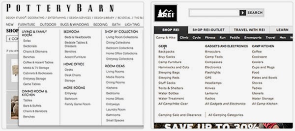
So the solution is to Making parent categories a part of the product hierarchy so that the user who is just trespassing over website should dip his toe before living. If you have defined parent categories well, user can also go through subcategories. Just remember this is not only for drop down menus but for every hierarchy.
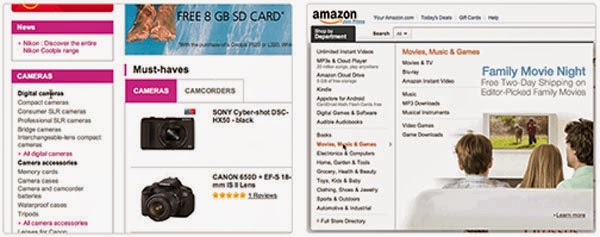
Put same subcategory within multiple main categories when necessary.
When a particular subcategory is supposed to & logically should appear in multiple parent categories but appears only in one, users can find it inconvenient. E. g. “Chocolates” can appear in Gifts as well as eatables. So, it is necessary you give users the ideal solutions in all categories. This can be done in two ways:
1. You can put the subcategory in one place and then link it to destination in the other parent categories.
2. Alternatively, you can duplicate the categories so that each is a unique entry in the website’s hierarchy.
It avoids the severe usability problem of visitor of not being able to find a sub category. So always consider putting same subcategories within multiple main categories.
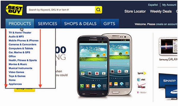
“What’s New” category is must.
Users always love to see what’s new in the city. & if you don’t provide it at the first site, his mood is gonna off. So “What’s new” category is must. “What’s New” is a great way to support render visitors, so that they can easily seek what new products are in markets since their last visit. It is the case specially for seasonal products.

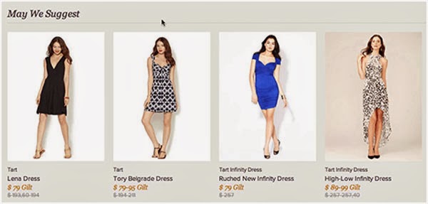
Suggest Alternative And Supplementary Products On Product Pages.
You should always give them options, be it about colors, alternatives, substitutes, add-ons. Up-selling & cross-selling is always good for business. & when you implement it appropriately, these can be great for usability also. If user comes where he cannot find alternatives, he is going to abandon it. So suggesting such alternatives is good for user since he can compare things at the same time.
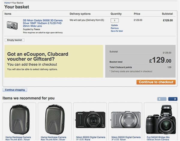
List “Recently Viewed Items.”
Re-finding a previously visited product becomes hard when the user has to rely on the browser’s “Back” button or has to re-navigate the categories or reuse search. Subject i.e. user often wants to navigate to previously viewed products for comparison of products. Imagine he is trying to relocating the product & he gets irritated when he can’t find the same. Then what will he do? Simply go to other site.
So, to let him comfortable with purchase, always provide “Recently viewed items”!
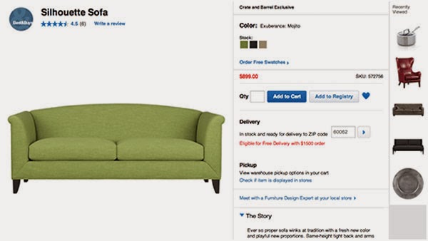
Create dedicated pages that list compatible products.
Users have a difficult time finding compatible products and verifying their compatibility when the website doesn’t explicitly state their compatibility or link to the corresponding products. Finding a spare adapter for your laptop or buying a camera and matching case might sound like trivial tasks. But for user it is as hard as travelling to moon sometimes. For this solution is to create a page that will be dedicated to list of compatible products.
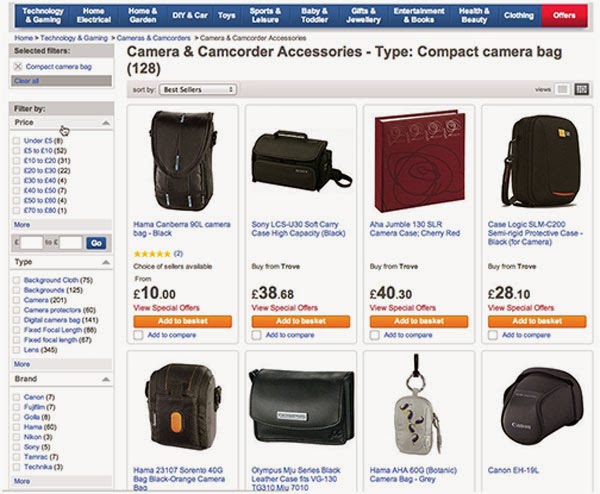
Always link contextual images directly to the products shown.
User feel irritated when they see product in contextual image & just can’t navigate to it. It happens many times when were dumbfounded that a website didn’t simply link directly to all products depicted and that they had to hunt them down to learn more or to purchase them. Images tend to draw a lot of attention. Use this concept & try to always link contextual images directly to the products shown.

Remember, if user is not going to find it, he is not going to buy it. It is the time when customers are accessing e-commerce websites more & more. Designing customer friendly & category based navigation is not an easy task. You have to meet up with their searching style, their expectation & all. But we are here to help you out.
With these 7 magic rules, you can rule the e-commerce world for sure
But while designing & developing e-commerce sites, you have to keep some particular things, some guidelines in mind. You have to follow these rules veraciously. If customer is looking for a thing which he is unable to find, the website fails its purpose totally. If he fails to find the product, it means site fails to provide him better navigation & categorization. Be it any kind of product, electronic good or just a lipstick, if you are making it hard for user to find it, he surely is going to abandon the website. So what to do? Is there a solution for this? Of course, YES! Here are the E-commerce study- the guidelines for better navigation & categories.
For any e-commerce business, the key is product find ability. You make navigation easier & let the customer be thorough the categorized, it’s sure that you gaining customer here. Make user navigate easily from one product to other. He should not feel confused about where to find product. Categorize your product, alphabetically or the code user will be comfortable with. A research study on the product finding experience has shown that despite the website having been built for multimillion dollars, subject i.e. user has encountered problems with correct system of navigation & comfort. The user mainly looks what he seeks on home page, category navigation, subcategories & product lists. These are, like, your key areas to catch your user & retain it. For better navigation, you can have navigation bars, drop downs, site maps or breadcrumbs. The navigation bar describes the links to the primary areas of the site. Ideally it should use simple text anchors that describe the target page totally. Also many complex websites sometimes make use of drop down menus to provide further options from the navigation bar. On some sites, we have a ‘breadcrumb trail’ near the top of the page that looks much like this:
Home > Products > Computers > Peripherals
This tells visitor where he is exactly in site.
This was about navigation. Now talking about categories, you can sort your products in the specific categories. You can use these categories in navigation bar or in drop downs too. Using categorized design makes more sense for visitor to go through stuff. Make these visible on homepage only & visitor is gonna love it. Because then he doesn’t have to ‘hush hush’ while looking for product.
Here are some rules that will help you out for building a user friendly website. Follow these guidelines based on the survey of online shoppers & you are surely going to rock with your site.
So here are the 7 guidelines to make navigation easy for user.
Have Parent Categories & make them stronger & prominent.
When the hierarchy of categories is just labels and headers, visitor loses the interest. It breaks his anticipations & forces him into narrower sections than they seek. Hence, you have to make categories to the point & manageable for user. On the other side, on many of the websites, the drop-down categories are only text labels, not actual clickable elements. This leads user to think that this site doesn’t meet up with our expectations. So he bans it.

So the solution is to Making parent categories a part of the product hierarchy so that the user who is just trespassing over website should dip his toe before living. If you have defined parent categories well, user can also go through subcategories. Just remember this is not only for drop down menus but for every hierarchy.

Put same subcategory within multiple main categories when necessary.
When a particular subcategory is supposed to & logically should appear in multiple parent categories but appears only in one, users can find it inconvenient. E. g. “Chocolates” can appear in Gifts as well as eatables. So, it is necessary you give users the ideal solutions in all categories. This can be done in two ways:
1. You can put the subcategory in one place and then link it to destination in the other parent categories.
2. Alternatively, you can duplicate the categories so that each is a unique entry in the website’s hierarchy.
It avoids the severe usability problem of visitor of not being able to find a sub category. So always consider putting same subcategories within multiple main categories.

“What’s New” category is must.
Users always love to see what’s new in the city. & if you don’t provide it at the first site, his mood is gonna off. So “What’s new” category is must. “What’s New” is a great way to support render visitors, so that they can easily seek what new products are in markets since their last visit. It is the case specially for seasonal products.

Suggest Alternative And Supplementary Products On Product Pages.
You should always give them options, be it about colors, alternatives, substitutes, add-ons. Up-selling & cross-selling is always good for business. & when you implement it appropriately, these can be great for usability also. If user comes where he cannot find alternatives, he is going to abandon it. So suggesting such alternatives is good for user since he can compare things at the same time.


List “Recently Viewed Items.”
Re-finding a previously visited product becomes hard when the user has to rely on the browser’s “Back” button or has to re-navigate the categories or reuse search. Subject i.e. user often wants to navigate to previously viewed products for comparison of products. Imagine he is trying to relocating the product & he gets irritated when he can’t find the same. Then what will he do? Simply go to other site.
So, to let him comfortable with purchase, always provide “Recently viewed items”!

Create dedicated pages that list compatible products.
Users have a difficult time finding compatible products and verifying their compatibility when the website doesn’t explicitly state their compatibility or link to the corresponding products. Finding a spare adapter for your laptop or buying a camera and matching case might sound like trivial tasks. But for user it is as hard as travelling to moon sometimes. For this solution is to create a page that will be dedicated to list of compatible products.

Always link contextual images directly to the products shown.
User feel irritated when they see product in contextual image & just can’t navigate to it. It happens many times when were dumbfounded that a website didn’t simply link directly to all products depicted and that they had to hunt them down to learn more or to purchase them. Images tend to draw a lot of attention. Use this concept & try to always link contextual images directly to the products shown.

Remember, if user is not going to find it, he is not going to buy it. It is the time when customers are accessing e-commerce websites more & more. Designing customer friendly & category based navigation is not an easy task. You have to meet up with their searching style, their expectation & all. But we are here to help you out.
With these 7 magic rules, you can rule the e-commerce world for sure
No comments:
Post a Comment